An Overview of Textile Screen Printing Inks
Screen Printing is a very versatile print process. If there is a flat surface, It can most likely be screen printed. A major consideration for any job, is the ink system to be used for a given material, or substrate. For this blog post, we will be focusing on textile applications. With the goal being an increased understanding and awareness of the abilities, applications, limitations, and economic factors that different ink systems provide.
Plastisol
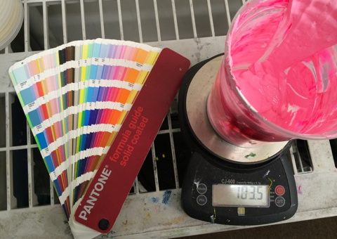
Plastisol ink has been the staple ink for the garment printing industry for many years, so it makes good sense to start here. Plastisols are non water soluble and they must be heated to cure. Therefore they do not dry in the screen and are easy to work with on press. They are very opaque on dark garments, and are relatively simple to color match using pantone mixing systems. There are a wide variety of additives available which provide an enormous amount of flexibility. In addition, many special effects can be achieved using plastisol inks. Plastisol inks are well suited to a number of garment types and blends which make it a very versatile ink system. Its consistency and repeatability make it the go to ink for printers around the world. The ink components are generally more expensive than waterbased or discharge inks, but due to the printability and ease of use, plastisol is generally the most economical and cost effective ink for the majority of the apparel industry.
Waterbased and Discharge inks (HSA)
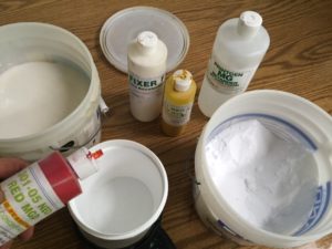
Waterbased inks have been growing in popularity recently, and for good reason. When printing waterbased inks, the ink is driven into the substrate, rather than sitting on top of the garment as with plastisol. Waterbased inks provide a very soft hand, after washing the garment will have very little to no hand. Waterbased ink is especially great for heavy nap fabrics such as towels where you want a soft surface. When cured properly, the ink will last for a very long time. Discharge inks are waterbased inks that utilize a ZFS (Zinc Formaldahyde Sulfoxylate) activator and work on 100% cotton fibers to remove the dye from cotton threads. For this reason, discharge is best used on dark 100% cotton garments. Testing is key when printing with WB and discharge inks, especially with blended garments. Waterbased inks are more difficult to mix, and while the ink components may cost less than plastisol, the time it takes to mix the ink, the requirement for hardened emulsions, and the on press characteristics of the ink make discharge a more expensive ink system in the majority of cases.
Silicone Ink
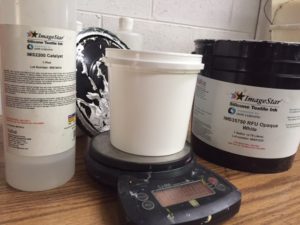
Of all of the ink systems, silicone ink is the newest. It was developed by Dow Corning in recent years to combat some of the limitations of plastisol when printing on 100% polyester garments. Polyester garments are heat sensitive, and they don’t like to hold on to their dye when heated. Sublimation and outgassing occurs near the cure temp of plastisol, which causes dye migration from the garment to the ink layer. For years low bleed plastisols have been employed often with less than optimal results. Silicone ink is quickly changing the way performance apparel is printed. Pantone colors are easily matched, dye migration is avoided, and the hand of this ink is unlike any other on the market. With more and more performance, moisture wicking, and synthetic blended materials coming onto the market, high performance ink is required. The high cost of the raw ink components do make it one of the most expensive ink systems that we use on garments. It is a catalyzed ink, so it has a limited screen life once mixed. This is one of the reasons that small batches become uneconomical to print with this system. Mid and large print runs are quite affordable when the ink cost is spread out over a larger number of garments.
The Keys to Success
Understanding the substrate, the ink systems, and a general knowledge of the print process is a must if you want to take your garments from good to great. As with anything, there are many ways to achieve the desired outcomes. The more that is understand about inks, garments, and the screen process in general, the more you are empowered to make great decisions when creating art, choosing blanks, and determining what ink is best for you needs. In future posts, we will explore each ink system in a more in depth way.

Tips for preparing art files in PS.
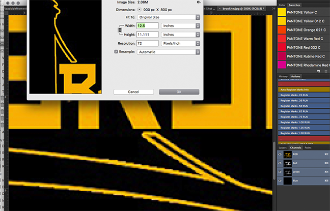
When preparing raster (pixel) based images for screen printing, it is important to follow some basic guidelines. First make sure that you start with good, high quality images at the proper resolution and size. The default resolution for most images that you will find on the internet is 72DPI. This is great for quick loading images on the internet, but if you try to use low resolution images for output, the results are almost always going to be sub par. The final output quality can never be any greater than the original source file, so it is essential to start with quality images a the outset. If you are using photographs in your artwork, consider taking your own pictures at a high resolution (300DPI min) using a quality camera and appropriate settings for lighting. You can always stage your photos to make eliminating an unwanted background easy. We will get to that in a moment, but first lets talk more about sizing. When working with raster images, it is important to keep it at print size. When you scale a raster image many times, it will dither as the computer makes up any information that is missing on the enlargement. This creates sawtoothing and pixelation, throughout the image. This is especially noticeable on hard edges and lines. This distortion will translate to the film positive, to the screen, and eventually to the garment itself, so I cannot emphasize enough how important the proper resolution and size is when working with pixel images. An easy way to check in PS is image > size. If it is at 72 DPI in resolution, you should find another image to work with. If you simply change the resolution setting from 72 to 300DPI, the compute will make up the missing information, which will cause dithering. Below, you can see an example of a low resolution image with sawtoothing.
We complete our separations for the press in Photoshop, using color channels. For this reason, it is helpful to have your artwork on a transparent layer with a separate background layer for the shirt color you want to print on. You can erase your background in a number of ways. One of the best is to use the magic eraser tool set to a low tolerance. You can also go to select > color range > ok using the appropriate tolerance. Once selected use the delete key to remove the background. If for some reason, your background layer is locked, you can simply duplicate the locked layer and keep the original in case you need to go backwards. You’ll know you have a transparent background when you have a checkerboard pattern around the edges of your artwork. You can then add a new background layer and fill with the appropriate shirt color. Make sure your layer order is correct, and the shirt color is at the bottom of the layers menu. 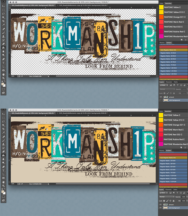
Now that you have a transparent background, you can add add text, vector elements, apply layer masks, gradients, filters, distressed effects etc. The sky is the limit, but do not make the mistake of flattening the layers in your image, this will make it impossible to move any design elements since you have essentially pasted your art onto a white sheet of paper. Keep the transparent background and instead use “merge visible” in the layers pane.
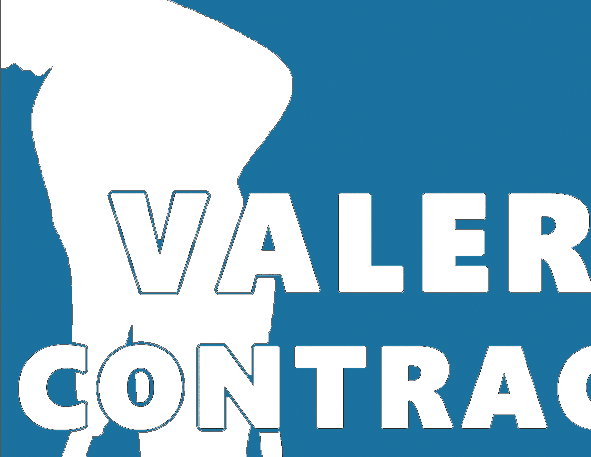
It is also important to consider the weave of the fabric in mind when creating artwork for screen printing. Very course materials such as towels, do not take well to fine detail, on the other hand very tight knit ringspun garments gold excellent detail and can hold very thin lines and crisp halftone dots. However it is recommended not to use text under 12pt, or to use lines that are thinner than 1pt. If in doubt, you can measure a line in PS by using the ruler tool. Another place where art can cause problems on press, is when there is too thin of a negative space between a large area of color. In the example below, there should be a larger “stroke” of color around the white ink to be printed. If this is not addressed during art creation, or prepress, the negative space will close up, as most ink systems on fabric tend to gain and spread out on the surface ever so slightly.
Once you are happy with your artwork, be sure to delete any unused layers and double check it for accuracy. If you have text layers in your file, you should rasterize the type layers by selecting the type menu > rasterize type layer. This is done to avoid font compatibility issues. Not all computers will have the same fonts installed, so be sure to rasterize your font to avoid any unintended errors or substitution. You can now save your file as a .PSD file and upload it using our order form here.
This is certainly not an all inclusive guide to PS, but by following some basic good practice procedures you can help us streamline your order, avoid errors, increase quality, and decrease turn time. If you’d like to get specific recommendations about your artwork, feel free to drop us a line so we can help.
Recent Comments